Authenticated Online Banking — Global Navigation
Redesigned Truist’s global navigation for 10M+ users, resulting in a 2.8x increase in PFM tool engagement and a 43% lift in credit score enrollments.
ROLE
Design & Strategy
CLIENT
Truist
DATE
2024


01
Discovery
How might Truist’s navigation provide easy access to top tasks, everyday finances, and necessary support while promoting the features and services the clients need?
Limitations
Too many items in the primary navigation have resulted in a “More” menu for overflow (essentially a “junk drawer”)
Numerous features have only one entry point from our dashboard; users have no way to access them from any other page
Users are going down wrong paths and having to back out
Poor hierarchy and naming conventions
Increasing number of requests to add new items to the navigation
Considerations
Review ways to better group navigation items
Offer entry points for Search and Truist Assist (AI assistant)
Review ways to better group navigation items
Explore a mega menu to surface more options and have a place for missing features
Make primary navigation consistent across all business segments (Retail, Business, and Wealth)
Keep scalability in mind


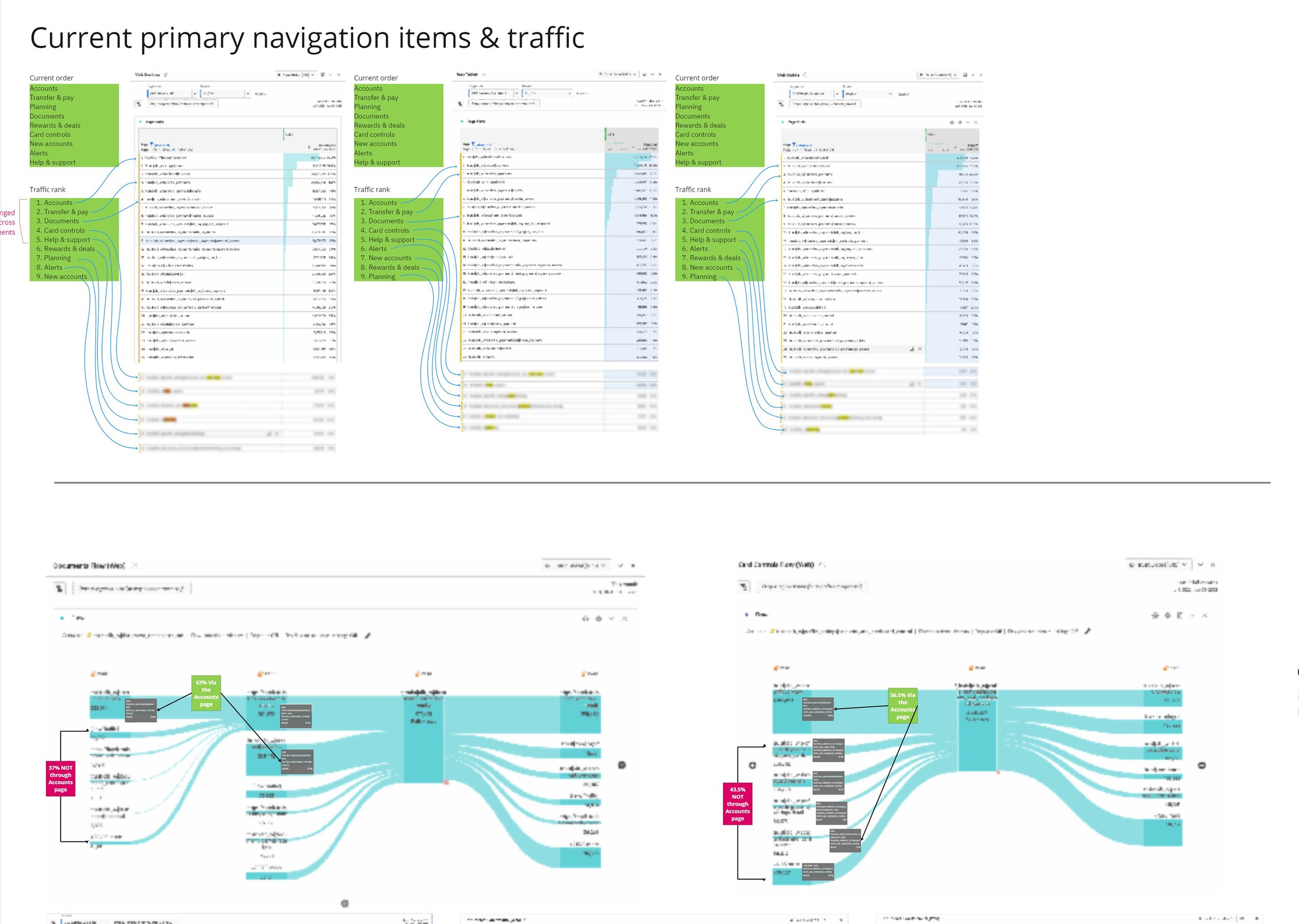

We combed through our architecture and put together a tree test to help refine some of the hierarchy and jumpstart our navigation groupings. Some of the flows are a bit of a loop back to the same landing pages so we wanted to make sure we weren’t duplicating entry points.
02
Research
Card Sort
137 participants from Truist’s user research panel.
Tree Test
112 participants from Truist’s user research panel.
Digital Banking Web Navigation Pattern Comparison
379 Community participants
Mix of clients & non-clients that are primary web users
10 tasks
Spanned all top-level nav items: Zelle, goals, card controls, security central, etc.
7 random tasks per participant
Authenticated Navigation Hierarchy Refinements Tree Test
470 Community participants with a mix of clients and non-clients
~155 participants per concept
Competitive Analysis
Of the 16 largest banks studied, 15 use mega menu designs


We also surveyed users on a light vs dark color palette, a horizontal menu vs a vertical / left menu, and general UI feedback around hierarchy and visual groupings. Feedback generally favored very minimal designs with straightforward layouts and lighter color palettes.
03
Wireframing & Prototyping
Mega Menus Work
Our research and user testing proved that a mega menu would help us best organize our online banking navigation and allow for much better scalability for the future. It surfaces top tasks quicker and allows users to dive deeper into flows with fewer clicks. We’re also able to use the space to visually emphasize relationships across navigation items when there are several comparable choices to make or for the more complex flows like Financial Planning or Payroll for our Business users.


We were very focused on getting the groupings correct since a lot of the features have multiple flows respectively. For example, we knew that users wanted quicker access to their transfers and money movement features but that didn’t mean they needed an entry point for every option for each feature, only those that fell within the “Top Tasks” given by our business partners.
04
Design & Takeaways
The navigation wasn’t originally designed with scaling in mind, which resulted in a catch-all "more" menu dubbed the "junk drawer". With this redesign we were able to surface and highlight our user's top tasks (as outlined by user feedback as well as industry benchmark studies) as well as address and solve for scalability.
Outcomes To Date (June 2024)
Increase in average number of daily Personal Finance Management by 2.8x
Visits to spending analysis increased by 12.7%
Credit Score enrollment increased by 6.2%
Reduction in 3 navigation clicks, resulting in a 43% lift in credit score enrollments and 7% lift on biometrics usage on mobile


